Best Record Sleeves: October
Records from Beau Wanzer, Shit & Shine, Dez Williams, Bing & Ruth, Line Idle and more caught the eye for their own particular reasons.
What makes a record sleeve so memorable? Sometimes it’s as simple as an eye-grabbing photograph, other times it’s a more subtle combination of typography and imagery linked intrinsically to the music within, or a continuation of a theme adopted over time by the label or commissioned artist. Whatever this certain je-ne-sais-quoi may be, it’s always invariably in the eye of the beholder, as commissioned artists are rarely afforded the public platform to express their creative motivations in a manner similar to producers and bands. This seems like an odd state of affairs given how integral good sleeve art has been to the vinyl format; certainly having some public resource to reference when putting together a selection such as this month’s would be most useful.
Take for example Tommorrow Was The Golden Age, the LP from Bing & Ruth released on RVNG Intl that has rightfully received wide praise, yet little attention has been paid to the artwork and design from Will Work For Good, which looks and feels as luxuriant as the music. Personally I’d like to hear from Kevin O’Neill and Karisa Senavitis whether the focal outlined image on the cover is a sly nod to the fact Bing & Ruth’s core member David Moore has a penchant for rocking fishermen beanie hats, and the identity of Seba, the individual referenced on the back cover. As it stands, such things remain a mystery, but take nothing away from another boldly presented record from RVNG Intl.
[slideshow_deploy id=’104586′]
Objekt’s debut album Flatland falls snugly into the lineage of excellent looking PAN releases, combining the photography of Joe Dilworth with design from Bill Kouligas and Kathryn Politis. The photographs below don’t truly convey all the facets of design that have gone into the album’s visual inception; such as the manner in which the track titles are embossed onto the sleeve, you really need to grip this one in your hands to appreciate the full effect. At the opposite end of the scale is the latest transmission from Wrong Island Communications, which continues the London via Glasgow label’s visual approach of bold photographic imagery that bears little immediate relation to the music.
You may know Pete Leonard for his affiliation with L.I.E.S. Records, having helped execute the design of the label’s first few releases, providing the layout for the 2013 compilation Music For Shut-Ins as well as designing this rather fine T-shirt. It was his artistic assistance that helped make the recent Beau Wanzer album all the more special, feeding into the Chicago artist’s love of B movie horror films for the ghoulish array of individuals that adorn the LP’s sleeve, insert and record art amid some gothic typesetting.
It would be an understatement to call last year’s Shit & Shine release on Gangsigns provocative; everything about Find Out What Happens When People Start Being Polite For A Fucking Change seemed geared towards inciting some sort of reaction (mostly laughter here in case you were wondering). Tropical saw Craig Clouse’s perma-fluctuating project return to the emergent label and put aside such provocational methods, leaving you to focus on the music (as inspired as ever) and some great screenprinted artwork from Riot Season boss Andrew Smith.
Heleen Blanken is no stranger to working with techno artists, both in her capacity as a resident visual artist at Amsterdam venue Trouw and her more specific role alongside Jeff Mills, Rødhåd, Klockworks and 2562. Her working relationship with the latter artist extended to a still from Blanken’s surreal yet visually stimulating “life2” being adapted and used as the cover art for 2562’s album The New Today. The surprise new album of material from mythic Chain Reaction artist Shinichi Atobe on DDS may have arrived in a shade of pea green that will divide opinion, but the overall design of Butterfly Effect was akin to an archival document from days gone by, dusted down and presented for contemporary inspection.
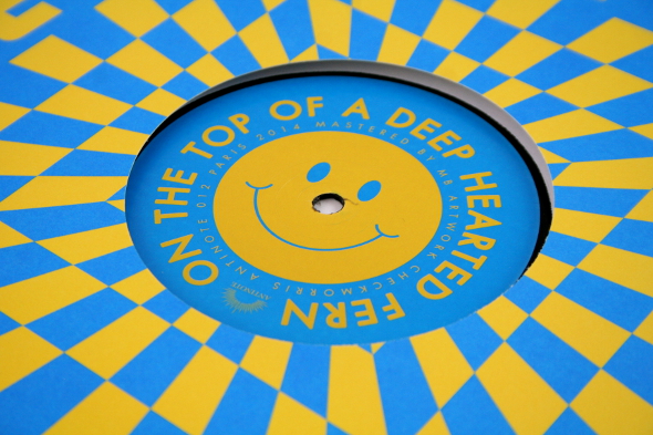
The combination of Check Morris and Antinote Recordings continues to be as inspirational as ever, with the agency once again on inspired form for the playful design work that covered On The Top Of A Deep Hearted Fern by Geena. Equally, Eloise Leigh excelled on her latest Dark Entries commission, riffing off the artwork for Charlie’s Italo disco classic “Spacer Woman” in its rare 7″ edition, and losing none of the impact despite the increase in scale. A third release from Bedoiun Records suggests the UAE-based operation fully intends to explore the deathly, morbid aesthetic adopted by many other labels dealing in contemporary techno. However, there is an attention to detail apparent with the execution from Bedouin that makes the label stand out.
All selections by Tony Poland
[nggallery id=46]