Best Record Sleeves: March
Idle Hands, LIES, Blip Discs, Sexes and The Trilogy Tapes all feature on this month’s edition.
Looking back over March there were two records in particular that stood out, both for very distinct reasons. The first was Authentic Exoticism, the latest slab of Don’t DJness from Florian Meyer that arrived via the Sexes label he runs with Marco Buetikofer and Lotte Meret Effinger. Along with Meyer’s music, both Buetikofer and Effinger contributed to Authentic Exoticism; the former did the 3D rendering and the latter acted as a sort of art director. There is a lot to take in when assessing the record as a whole, not least the front cover image that might turn weaker stomachs. What really gets me is the feel of the design; open the gatefold sleeve to view the text and it feels less like a record and more like a pamphlet. I am quite sure this is intentional and that’s why Authentic Exoticism belongs here.
The other sleeve design from March that made its mark in my affections was Matt Karmil’s second album, IDLE033, which took an approach as simplistic as the title was unassuming. According to the label, it was Karmil’s idea for the artwork to be based around a series of black and white circles  expanding out from the centre, and trusted Idle Hands designer Chris Yeates implemented it superbly. Stripping down the aesthetic approach to a single, repeated pattern in these monochrome tones is remarkably effective and lends the album an immediacy that only adds to the charms of Karmil’s superb productions. Side note: it could also feasibly be used as a successful tool for hypnosis.
Sitting along similar artistic lines was the third release from Blip Discs, a relatively fresh label out of “London via Leeds via Luton” that has benefitted from some high profile DJ support to date. There has been an air of anticipation surrounding O’Flynn’s Oberyn 12″ but not really that much mention of the artwork for it. Lets change that by applauding Eddie Cooper of Manchester-based design consultancy, ²Fold Studio, for the detailed patterns and bold typography he produced for Blip Discs. Cooper was kind enough to contribute the following regarding his intentions and processes for the design.
“A lot of the album/EP artwork I design is really focused on typography, just relying on manipulation of the letters in the artists name/titles themselves in different ways to create these unusual designs, which is why Tom (Blip) wanted to work with me. They wanted the name O’Flynn to be the focus point of the artwork so that the name would really stand out in the record shops and that. So the artwork really comes from a combination of both our styles; combining my strong typographic approach to design with the Blip Disc signature look and feel.”
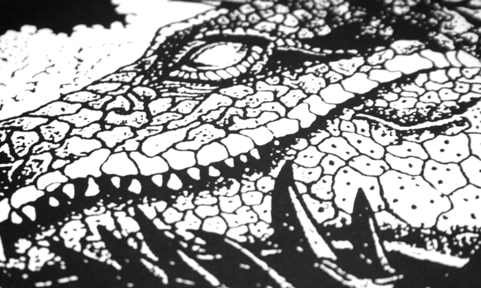
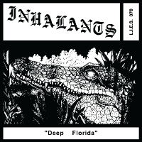
One aspect of L.I.E.S. that does not perhaps get the outside attention it deserves is the artistic contribution of Pete Leonard. Responsible for that iconic logo for Ron Morelli’s label, as well as their design and layout, Leonard is very much an integral cog in the L.I.E.S. machine. He’s also the man that designed those New Age Music t-shirts you might have seen around. The Inhalants album, Deep Florida, saw Leonard team up with Philadelphia artist Matt Bellosi for my favourite L.I.E.S. sleeve since KWC 92’s Dream Of The Walled City.
 Coincidentally, Leonard’s design skills were additionally put to use in March on the debut album from Bookworms, which also doubled up as the first release from Entro Senestre’s label BANK Records NYC. The main Pollock-esque imagery on Xenophobe originates from a tagger bar in San Francisco, photographed by Bookworms producer Nik Dawson himself. Given that some of the music itself dates back to Dawson’s time on the West Coast, this lends the artwork a pleasant sense of consistency. Leonard’s usage of bold typesetting and outlines also aligns nicely with the style of the label logo.
The name Will Bankhead rears its figurative head within the confines of this column once more in celebration of the new Ondo Fudd record on The Trilogy Tapes. Blue Dot made this writer tap into the lower recesses of his memory to recall that it is indeed stalagmites that are the upwards growing mineral deposits you will find in caves as depicted on this superb TTT sleeve.
Having witnessed Amnesia Scanner near decimate the sound and lighting of Hotel Forum’s main room at last year’s Unsound festival, I am not sure just how well their music works within the confines of the single format. Irrespective of this, the duo’s somewhat surprising AS 12″ for XL subsidiary Young Turks came with some fine artwork from the Berlin-based PWR Studio. Like the best art, the front cover fully reveals itself only after you spend some time assessing it, and contrasts nicely with the hellish vision depicted on the rear.
All selections by Tony Poland
[nggallery id=64]