Best Record Sleeves: February

Gobstopper Records, Contort, Diagonal and Subtext make the grade for February.
A small but perfectly formed selection this month commences with the luminescent, foil-covered figure that adorns Loom’s European Heartache 12″ for Mr. Mitch’s Gobstopper Records. High definition and hyper-realised imagery has been a visual hallmark to much of the music seeping out of London these past few years; think the Night Slugs aesthetic, or releases on Local Action from Yamaneko and Deadboy. It’s an approach Gobstopper have adopted too, dating back to their days as a digital-only label with eye-catching artwork on singles from DarkO and Strict Face. European Heartache saw the label work with Thomas Traum – a visual agency overseen by Thomas Eberwein that has previously provided excellent design for Numbers – at the behest of Loom himself. Speaking recently with Hyponik, the producer professed a great deal of admiration for Eberwein’s work, and European Heartache is a fine addition to the German’s portfolio.
There is a lofty concept to the new album from Paul Jebanasam, with Subtext describing it as a “speculative soundtrack to a timeline stretching from the primordial emergence of organic life through to the unknowable trajectory of the universe.” How that plays out musically is not for discussion within the confines of this column, though the album has made a suitable impression on my colleague James Manning. The artwork has certainly caught my eye though, with a front cover image making full use of a rather imposing fusion reactor housed at the Culham Centre for Fusion Energy. For those with little knowledge of fusion energy but plenty of science fiction films (I include myself in this group) the massive metallic structure on the Continuum cover provides ample inspiration for the imagination to run riot.
Alessio Natalizia’s debut proper on Diagonal as Not Waving came late last year with a one-sided 12″ with candy-striped artwork that was a bit too close in concept to those FunkinEven records a few years ago. Thankfully, the Not Waving album that arrived earlier ths month proved much more visually rewarding and consistent with the label aesthetic as a whole. The joy in Guy Featherstone’s design for Diagonal is the little details; on Animals, it’s the way the square shapes containing the tracklisting and album credits have been layered atop of one another. Erratic and haphazard in their positioning, this conveys the chaotic nature of the music as does the somewhat lurid palette of colours used.
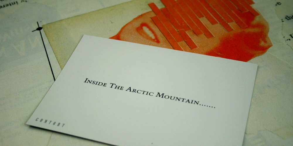
Launched last year, the Contort label from partners-Kerridge came brandishing some distinct, line-based design across its first few releases with local Berlin producer John Osborn responsible for the artwork. A change in visual direction has become apparent however, with Contort seeking out Canadian artist Anthony Gerace for their two most recent releases with his work on the SØS Gunver Ryberg 12″, AFTRYK, quite exemplary. For those unfamiliar with Gerace, the artist and photographer’s work is based around dreamy collages, mixing visual imagery from a bygone era with bold typography and strange abstract touches. His artwork for AFTRYK is reminiscent of Jonny Costello’s visual approach for Perc Trax, with the S&M themes swapped out for a more innocent feeling.
All selections by Tony Poland
[nggallery id=63]