Best Record Sleeves: October
Records on Tectonic, Relative, Where To Now?, Honest Jon’s, and Peak Oil feature in this month’s edition.
Whilst the origins of rainforest techno is not a discussion for this column, Dynamo Dreesen and SVN’s Dresvn collaboration best encapsulate the sound currently (despite Pitchfork’s suggestions to the contrary). Whether the Acido and SUED founders agree with this description is unclear but their Honest Jon’s debut suggests they were toying visually with the notion. Central to First Voyage is a 2014 piece by Michelle Jarvis called Light & Shade, a fine example of the UK visual artist’s textile work themed around the natural subject. Jarvis informed me over email that Andreas Krumm (Dynamo Dreesen) was a big fan of the Light & Shade piece and saw the Honest Jon’s record as the perfect opportununity to use it. Additional layout and the paint daubed Dresvn on the front cover comes courtesy of Will Bankhead with guidance from Krumm.
Los Angeles label Peak Oil don’t put out records all that regularly, and this may well be down to the extra effort they put into each of their releases. Swiss artist Florin Büchel debuted on the label last month with another new project in the shape of Operation Midnight Climax which seeks inspiration from some of the CIA’s shadowy experiments with LSD during the Cold War years. How did Peak Oil  chose to convey this theme visually? A pattern of Peak Oil logos with a comic depiction of some cosmic hero painted over them which look quite similar to a blotting pad of LSD tabs, complemented by a printed insert featuring plenty of redactions. The holographic image adorning the cover of Peak Oil’s new Personable release is also quite eye-catching!
Oliver Pitt is no stranger to glowing praise within the confines of this column thanks to his artistic endeavours on the record sleeves for Golden Teacher releases (he is of course an integral part of the band too!). Pitt was among the Glasgow musicians who collaborated with African contemporaries from Belize and Ghana over an 18 month period which recently resulted in the excellent Youth Stand Up! album issued through Autonomous Africa. The album gave Pitt the chance to flex his design muscles once more, and he opted for a less outlandish approach than some of the Golden Teacher sleeves. Photography of the album’s contributors was laid out over a simple two-tone motif which proved highly effective in channelling the cross-cultural communal vibe of the music
A chance inclusion from October comes in the shape of the Soundspecies 12″ Balafon Jam which inaugurates The Beauty & The Beat label, an extension of the long-running, roving East London club night. Alerted to the record by the fine B-side deep dub from Salon Des Amateurs man Wolf Müller, anyone with a set of eyes cannot fail to be impressed by the delicious patterned artwork that covers the sleeve. The label informs me inspiration comes from an African fabric Ollie Keen of Soundspecies possesses, with fashion designers Sara and Juliette, close friends of The Beauty & The Beat, stepping out to do some excellent sleeve design.
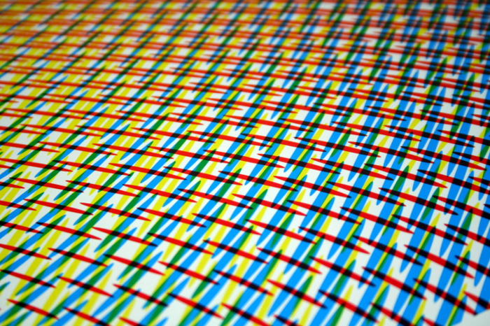
Another record that caught the eye due to some colourful patterns was the debut Ipman album on Bristol’s Tectonic Recordings, with Studio Tape Echo once again excelling. The supplied photos demonstrate how good the art is much better than any words I could supply, but looking to get some insight behind the inspiration for the artistic contribution to Depatterning, I emailed Alex Digard from the design agency who offered the following explanation. “The artwork started as an exploration of patterns and repetition, breaking a halftone image down to its basic parts and taking three dots (cyan, 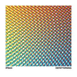 magenta and yellow), then building a rigid grid from them,” Digard says, adding, “each rigid pattern was then warped to varying degrees and overlaid to create new, fluid forms.”
Two years ago the Relative label was rightly included in this column for the Frames 12″ from Vinalog which really captured the eye thanks to their usage of a quite captivating photograph from Milanese photographer Alicia Futura Bridger. Vinalog’s latest 12″ for Relative, Perspectives, once again called on Bridger’s compositional talents with the artist again taking inspiration from the record title. As a kid I was obsessed with the concept of perspective in art, hours happily spent drawing long corridors, or horizons strewn with high rise architecture. Bridger’s dark depiction of a corridor, with only roof lights and their reflection offering guidance brought these memories back vividly.
The latest release from Where To Now? rounds out this column, with the label’s increased vinyl output continuing to impress visually. October saw the return of Parisian artist Thomas More as December, a project that first surfaced on Where To Now? with a self-titled cassette last year. Label co-founder James Hines continued his design input under the name Studio Of The Immaculate Heart, providing some clever typesetting that really complemented the cover illustration from Louisa Gagliardi.
All selections by Tony Poland.
[nggallery id=59]