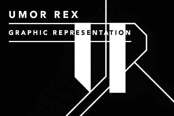
Umor Rex: Graphic Representation
Emma Tucker discusses the clean typography, use of geometric shapes, bold colours and striking photography that distinguishes Mexican label Umor Rex with founder Daniel Castrejón.
Umor Rex founder Daniel Castrejón has been putting out faultlessly designed releases for the last eight years on both cassette and vinyl, pairing clean typography and geometric compositions alongside striking black and white photography. Citing Kandinsky and Josef Albers among his sources of visual inspiration, as well as his home town of Mexico City, Castrejón uses design to create a true graphic representation of the music itself.
Since 2006, when the label was launched from editorial project Contramotor, Umor Rex has amassed not just an incredible collection of music, but of bold design. With its disciplined use of colour and minimal forms, the label has refused to conform to visual stereotypes. Given this strong identity, it’s no surprise to find that Castrejón’s day job is that of a designer at a publishing house in Mexico City, where he creates editorial design for books and magazines. A drummer back in his school days, Castrejón explains that he never considered himself a musician, but found himself attracted to the visual side of music and the arts. “I love everything about publications, exposing the work of artists that I admire, sound and visual arts. I like the work of documentation and archiving of information,” he says, going on to explain that his own thinking is always shaped around design solutions, whether for books, records, or any other form of printed matter.
[slideshow_deploy id=’107650′]
His day-to-day experience plays an underlying role in his approach to Umor Rex, and Castrejón admits that he can’t completely disengage from his job while designing for the label, drawing parallels between the two worlds. “The record label has the same function as an editorial publisher,” he says. “To document, publish and archive labour, for the present and for posterity.” As well as lessons learned from his day job, Castrejón takes inspiration from some of the greats of art and design – Robert Rauschenberg, Josef Albers and Kandinsky – as well as the forms of modernist architecture. He tells us his surrounding environment also plays a role, with Mexico City’s mix of architectural styles and its rich tradition of visual art.
Castrejón agrees that before hearing the music, people’s first relationship with a record can be the one formed through eye contact. But while artwork can be influential in itself, Castrejón believes that design is in service to the record itself: less about pure aesthetic and more about creating a visual description of the music. With this kind of thinking in mind, the design for each record is meticulously considered in relation to the music itself, with an in-depth design process behind each release. Castrejón tells us this involves concentrating on getting the ‘temperature’ of the music – “I try to identify elements – organic, inorganic, materials, abstracting what the music tells me on a visual level.”

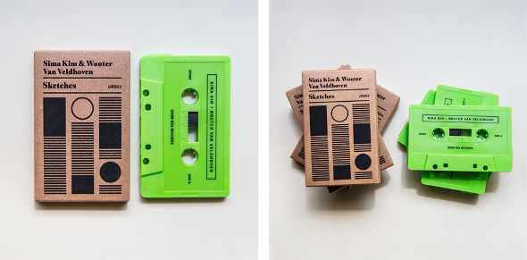
The Umor Rex releases are particularly striking in their use of colour, and Castrejón says that he prefers to work with a restrained ‘short’ palette. “Umor Rex can be understood as a minimalist label. It’s minimal conceptually speaking. I like the use of limited resources, for example, I like to use pure colours.” Castrejón’s choice of type follows a similar philosophy, restricting himself to working with three or four families, and two or three variations of sans serif and serif fonts. He tells us, “the typography use is always a constant. My background is editorial, and is something I can’t disengage from when I’m designing for Umor Rex. The type in our releases has two functions: information and as an element of design.” Castrejón’s disciplined approach is most obvious in Umor Rex’s collection of tape releases, which he says he likes to imagine as “sketches or manuals of old technology.” Uniting colour and form seamlessly, the tapes also have an element of craftsmanship, with each of them silkscreened by hand.
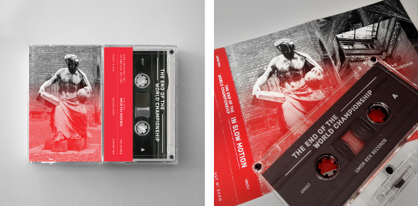

It’s clear that Castrejón’s approach is one of discipline. However, there’s more at work here than straight up technical decisions. He’s also creating a response. “I try to invite the existence of some hidden history,” he says. “Free of interpretations. There is a theatrical element that is proposed by the photo in the records and by the geometric forms in the tapes.” More importantly is Castrejón’s insistence that design’s role is not standalone, but an essential part of understanding the record itself: “The work of the designer is to try to decipher the audio code, and represent it in images. It’s like the work of an interpreter. Personally I like when a record, besides having good music, has a good aesthetic solution. I think if you manage a record label, you have to expose in the best way the work of the artists. It is an obligation and right that music deserves, beyond ideologies on visual concepts.”
Interview by Emma Tucker